I could improve my work by going into more detail with my opinions throughout my project, I could also make more experiments from my existing album covers I have created on Photoshop CS4. I could improve by looking at multiple album covers from different genres in music to see if there's a difference. Lastly, I could improve be creating something related to music for example, tickets, event posters, leaflets. I could not achieve this because I ran out of time however I concentrated most of my time on creating the album covers.
Tom Odell Music Project
Sunday, 1 September 2013
evaluation
My goal for this project was to find information about an event or a new artist which has been discovered this summer, I had to choose which path I wanted to follow i.e. graphic, video, animation, photography. I believe I achieved this by finding information and I got inspired to create multiple album covers from Tom Odell's original design. I thought the overall design of my album cover was good because it looked inspired by the original Tom Odell album 'Long Way Down.' I also thought it was good because I used the same colours and I tried to create a not too boring cover. The hardest part of the summer project was finding valid information about the artist because some articles may be written incorrectly. Secondly, I found making existing album covers to inspire from since there are so many genres to look at, I looked at popular artists because their album covers would be seen the most compared to the rest.
I could improve my work by going into more detail with my opinions throughout my project, I could also make more experiments from my existing album covers I have created on Photoshop CS4. I could improve by looking at multiple album covers from different genres in music to see if there's a difference. Lastly, I could improve be creating something related to music for example, tickets, event posters, leaflets. I could not achieve this because I ran out of time however I concentrated most of my time on creating the album covers.
I could improve my work by going into more detail with my opinions throughout my project, I could also make more experiments from my existing album covers I have created on Photoshop CS4. I could improve by looking at multiple album covers from different genres in music to see if there's a difference. Lastly, I could improve be creating something related to music for example, tickets, event posters, leaflets. I could not achieve this because I ran out of time however I concentrated most of my time on creating the album covers.
Saturday, 17 August 2013
final album cover
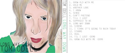
The photo is set to the actual measurements so that it is able to print and fit a CD case, I picked this one because it relates to Tom Odell's actual CD design because of the green and blue colours. I also like it because it looked more professional than the rest which I created. The one reason I can think of which people might not like it is because it might be too dark to catch customers attention.
This screenshot is showing that people have looked at my blog and followed it so that my designs/work appear on their "dashboard".
graphic design on album covers

I have been looking online for graphic designers who specialize in CD albums and music, sadly I could only find a new artists which do.
http://www.rodsteele.com/freelance-graphic-designer-in-london/
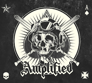
Rod Steele is a graphic designer and illustrator who specializes his work in music, his music has been used by Apple, Microsoft, KISS, ABC News. He creates designs for book covers, album sleeves and helping in advertising companies all over the world. This CD cover is what Rod Steel designed for a heavy metal band in 2013, I like this album cover because the white stands out from the black background. I also like the symbol in the centre of the design because it can relate to 'heavy metal
music' and that is what some people think of.
I am looking at Two Door Cinema Club's album design because I am interesting in the typography including in the cover. I like how the text is involved with the image of the kitten in the background with the letter 'o'. It is quite a basic album since it is just an image of an animal with little text at the centre. The text being white is a good idea because in my opinion, it stands out the most and it wouldn't work if it was any other colour i.e. red or black.
I liked looking at Of Mice & Men the band's cd cover for one of their albums because I like the style and how it is made. I like the centre but mostly the pale background informing you who the band is. It also includes a picture to give it more depth under the text. I could be inspired by this design by using the same text over and over at an equal distance.
Tuesday, 30 July 2013
Primary images for albums
These are my primary images of a variety which I may choose to use or involve in my designs, I like using flower and nature pictures because many bands have decided to create their albums based on looking 'relaxing'. I have also added my images which I have drawn so that I get some drawing skills shown.
Editing & experimentation

Some of my experiments and designs have been altered so when I print the final outcomes out, they are facing the same way to slide into a CD case. I prefer my first design to be the most success because I like the colour green in the background on the front cover and the white text stands out from the black lines and background. For my second design, I have been inspired by the 'Another Love EP' from Tom Odell's first EP. I like the colour but I think it is too boring and does not stand out like it should, I have tried to use the same techniques in the original on my design. My third design is a picture of Tom Odell which I drew on Photoshop, I did this because it could show drawing skills while presenting what I can do involving graphic design.
Friday, 19 July 2013
article on his music from NME & complaints
Over the summer:
After Tom Odell's new album being released, many magazines have been creating their own reviews on the album. The most famous one is a critic from NME magazine which rated the album 0/10, the review also quotes 'I wish I could say there’s a place in Hell reserved for Tom Odell' many people have complained about the review being too offensive and unfair however some people have agreed that "it is the truth." http://www.nme.com/reviews/tom-odell/14533Another well known article is the reaction from Tom Odell's family especially his father who rang NME to complain about the review being 'too harsh on Tom.' Many of Tom Odell's fans believe to now call his father a hero for doing the right thing! http://www.telegraph.co.uk/culture/music/10131598/Tom-Odells-embarrassing-dad-calls-NME-to-complain-about-review.html
analysis on his album cover

'Long Way Down' released summer 2013
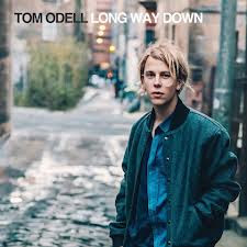
His new album 'Long way Down' is quite basic and the colours are very similar - using many blues, greys and greens. I like how he is stood at the top of a road which could emphasise that looking down the road is a ''long way down''. It is a very simple album cover because it just includes the artist with a landscape in the background which could be found to be quite mundane to people. To create my own album cover related to his original, I could take pictures of existing roads at an angle where it looks like there is a long way down. I will firstly create an album cover being inspired by Tom Odell's cover then I will move on to look at other graphic designers album covers for bands.
Subscribe to:
Comments (Atom)


